Voiju: Brand Identity & Packaging Design
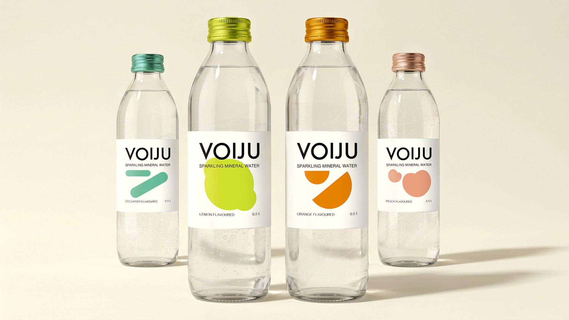
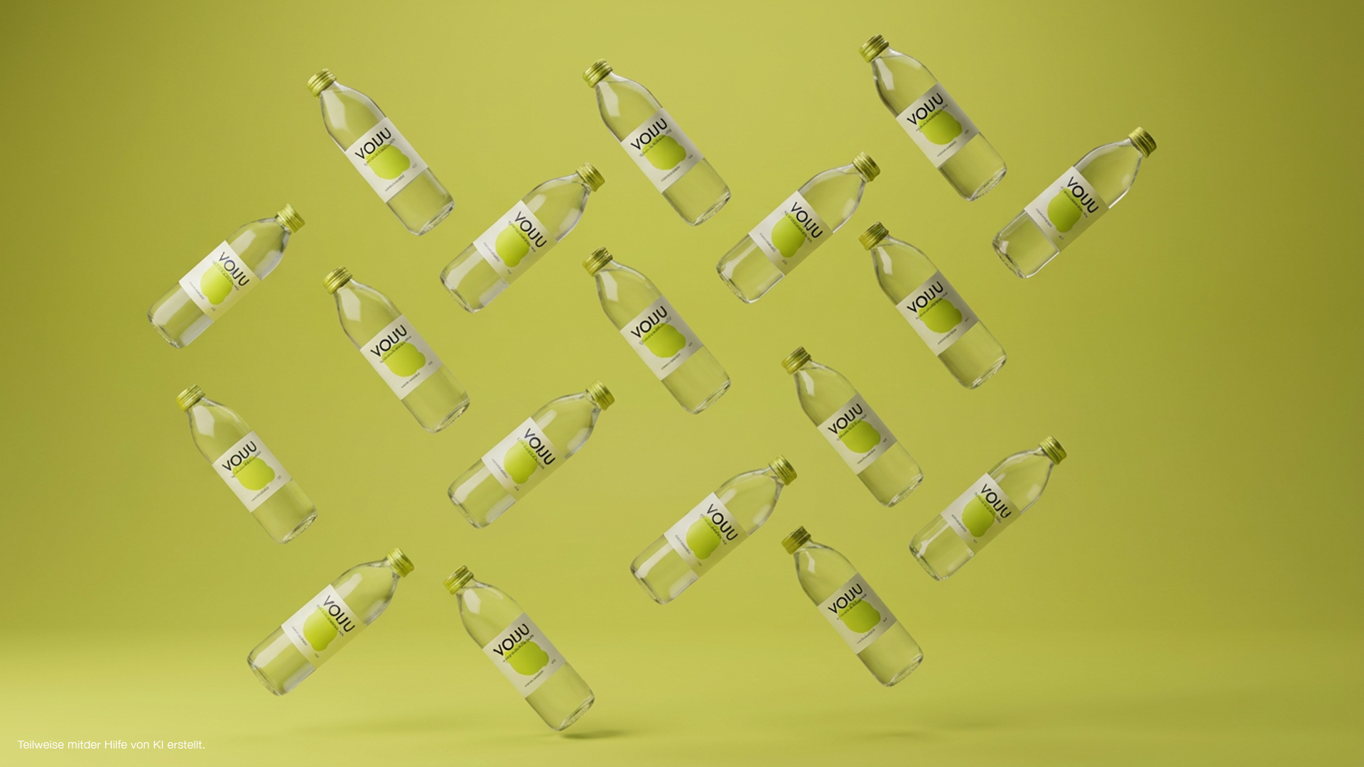
VOIJU is a conceptual flavored mineral water brand inspired by the little journeys we take in everyday life. Combining a fresh, modern identity with a minimalist design approach, the brand brings together color, geometry, and typography to create a distinctive visual language.
Each flavor has its own color palette and abstract graphic element, giving every bottle an individual character while maintaining a cohesive brand identity.
A little taste of somewhere else.
The Design Approach
The visual identity is built around simplicity and recognition. Rather than relying on literal fruit illustrations or travel imagery, VOIJU uses abstract shapes, distinct colors, and clear typography to express each flavor in its own way. The result is a contemporary packaging concept that feels playful, consistent, and easy to recognize.
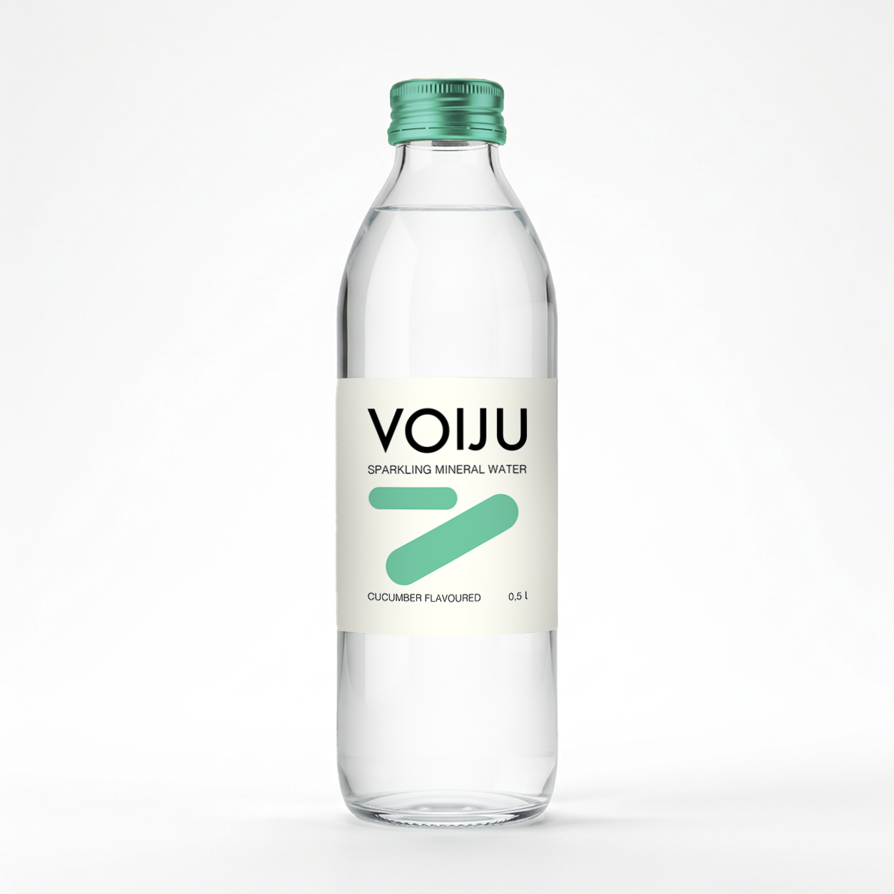
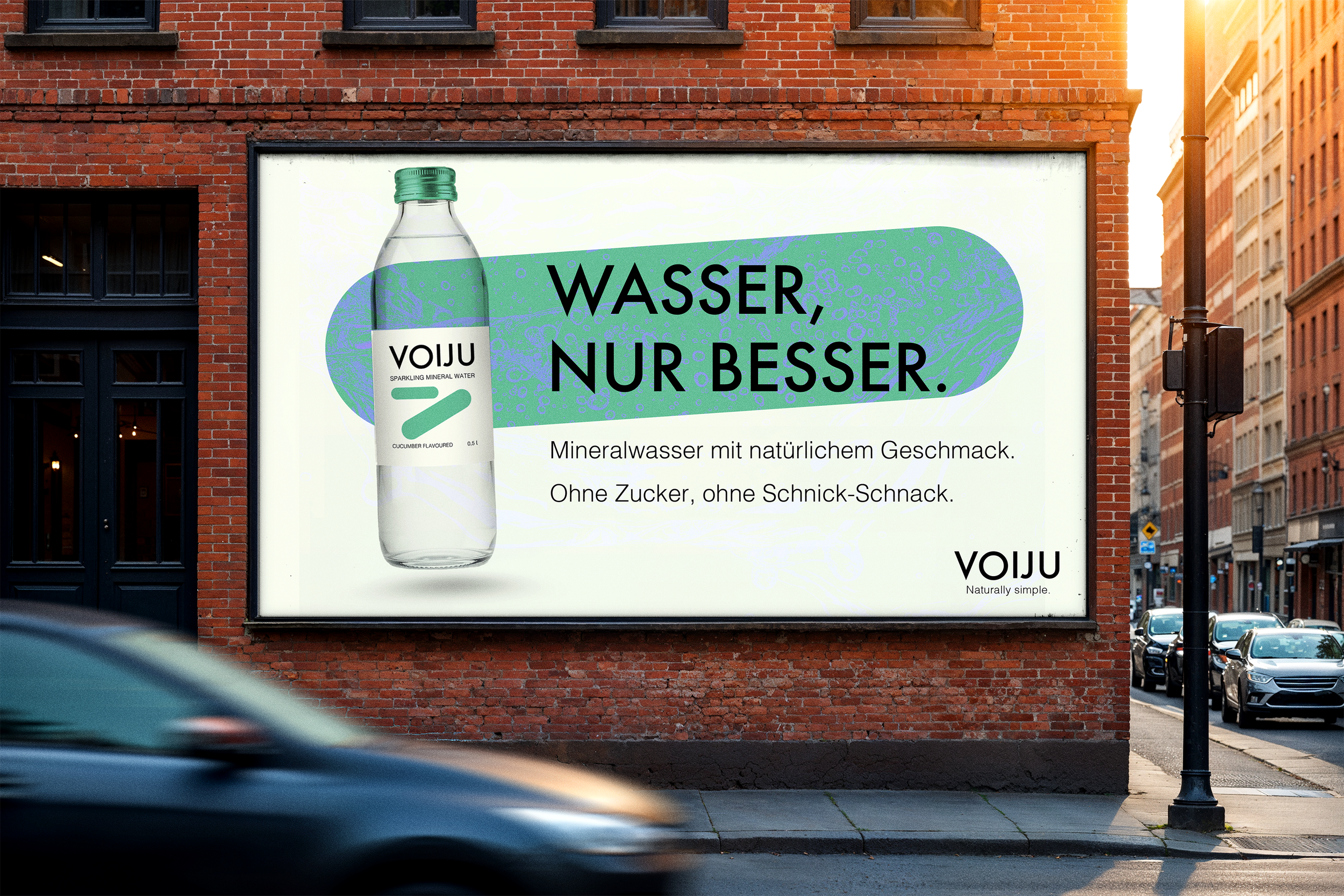
CUCUMBER
Cool and minimal. Fresh green tones and clean geometric forms reflect the light, understated character of cucumber.
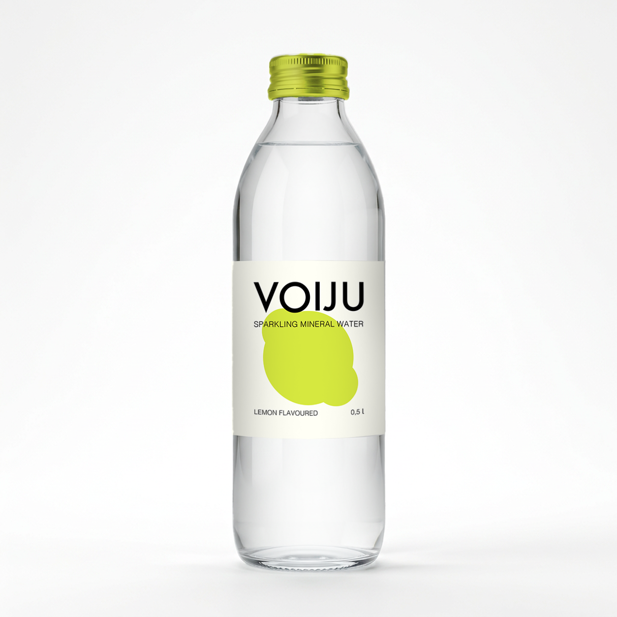
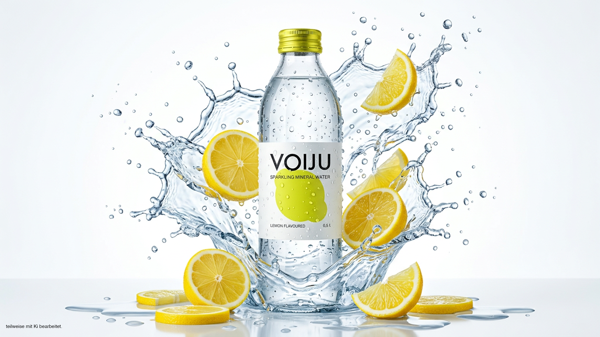
LEMON
Fresh and vibrant. A bright yellow palette and a bold geometric shape capture the crisp, refreshing character of lemon.
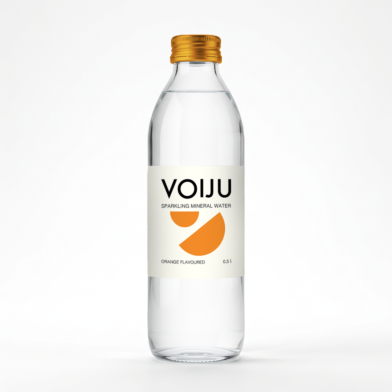
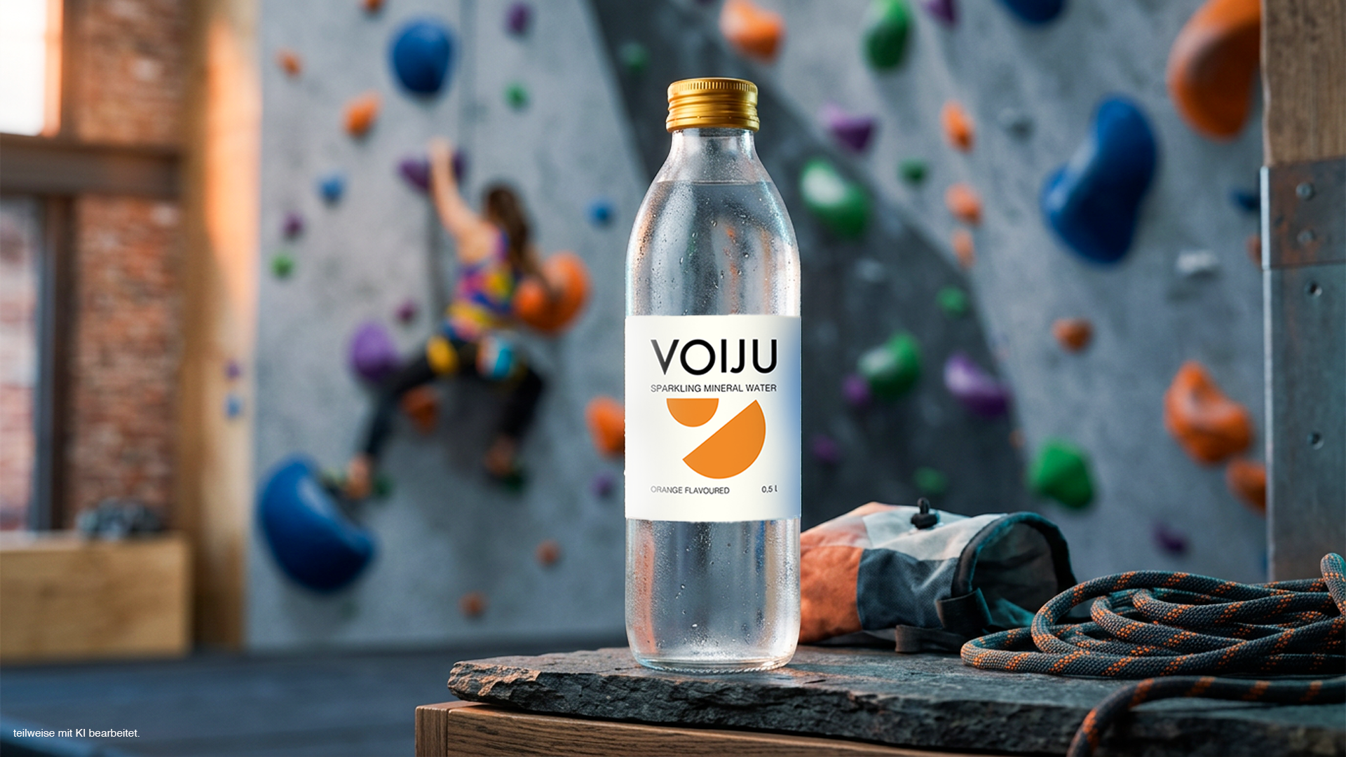
ORANGE
Warm and energetic. Orange tones and playful geometry give this variation a lively, expressive look.
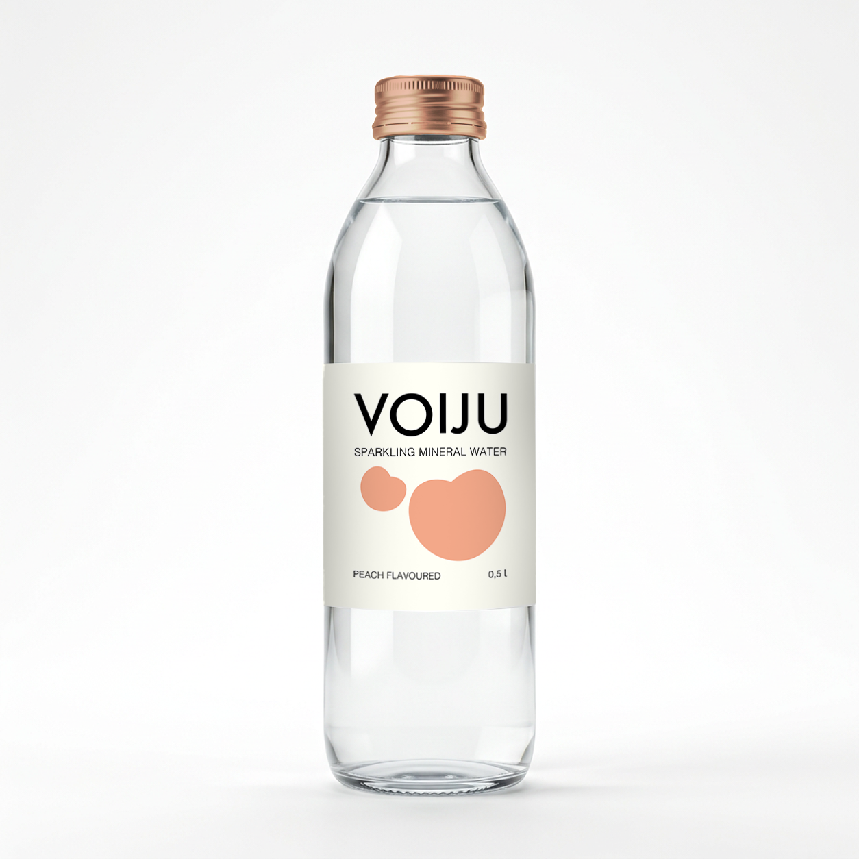
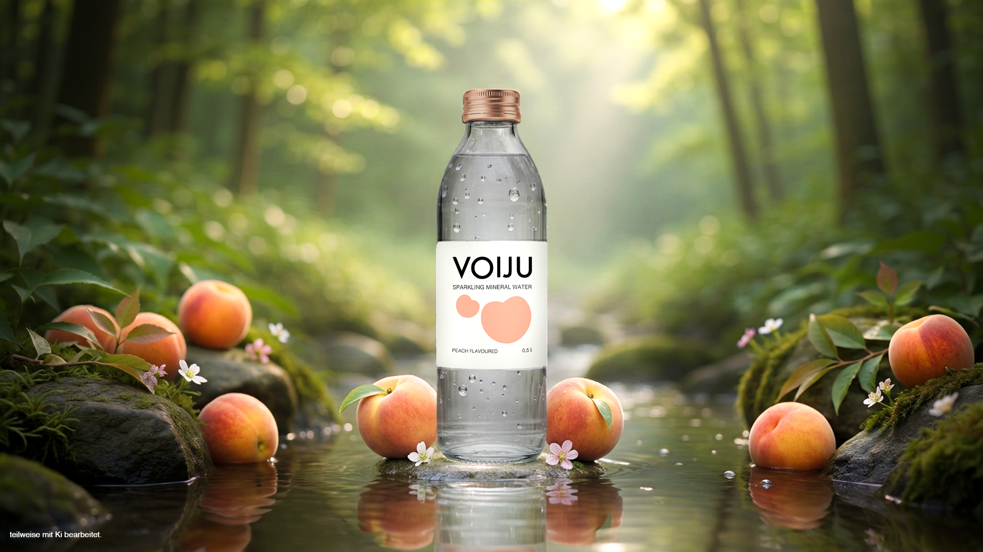
Peach
Warm and energetic. Orange tones and playful geometry give this variation a lively, expressive look.